Hello! And welcome to Good Copy / Bad Copy, the monthly newsletter of Muzzi Consulting.
Writing exists to communicate with readers. It sounds obvious—but you’d be surprised how easy this is to forget. In fact, one of my favorite ways to jar a student out of writer’s block is to simply have them explain their argument to me.

Imagining your end user is a great way to get unstuck. It’s also an effective test of quality. Can I understand this writing? Can I understand it easily? Is it saying what it’s trying to say? If so, then it’s probably pretty good.
Working with graphic designers has taught me that these rules apply to visual mediums, too. Superb design isn’t necessarily about having the flashiest, sparkliest thing—it’s about communicating—clearly and concisely—with an audience.
Take a look at the above failure of copy and design, from my own beloved home state.
To me, this feels like it was created for the benefit of the makers, not the consumer. It’s clever—but it doesn’t really say anything. I am MN? I am in MN? It’s anybody’s guess.
EYEBALL PANIC
Today, I want focus on how graphic design can increase the clarity of its associated copy: specifically, on typographic hierarchy, the process of using visual cues to indicate degrees of importance within a text, thereby helping your reader order, group, and process information.
Take a look at this excerpt from the New Jersey Retail Merchants Association.

We’ll start with just text. This copy is so redundant that it’s actually confusing—like when you say “toast” so many times that it stops sounding like a word.
My first stab at revision would involve cutting some information in order to arrive at a more readable introduction:
The New Jersey Retailer’s Association is a nonprofit based in Trenton, New Jersey. As the voice of the retail industry, we provide a critical link between business owners and state government.
Now, let’s think about how we might use design elements to further clarify things.
Here is the NJRMA’s landing page:

Eyeball panic is the term I used to describe the sort of queasy, anxious feeling I get when I see a site like this.
I’ve been presented with an overwhelming amount information, and I’m denied any method for organizing it. There are multiple columns, so I can’t just read from top to bottom. If I look for the largest text, I start with “NJRMA Events Calendar,” but I don’t know what the NJRMA is. My brain assumes that it is supposed to absorb all of this information simultaneously, and it sort of crackles and sparks like a pencil in the microwave.
Revising both copy and layout, I would suggest that the top-level content look more like this:


Here, visual design elements like color, spatial arrangement, and text size and weight are being used to shepherd the reader through the information. Designer and writer have been forced to make choices about what information to highlight, and this compression has brought the most salient information to the forefront: what the association is, why it matters, and how to find out more.
SURPRISE! THAT’S DESIGN THINKING

The basic principle of creating something by imagining it in use also applies outside of communications. Consider a smoke alarm that goes off when you boil water, a dutch oven with a beautiful copper handle that heats up to a billion degrees.
Empathizing with users is an important part of the design thinking process, and it can shape everything from infrastructure to products to social organization. Problems arise when users are either forgotten entirely or defined poorly—often, along narrow demographic lines. Consider this story about female scientists in Antarctica and the expedition parkas they wear to stay warm in sub-zero temperatures.

For researchers who don’t pee standing up, going to the bathroom in bib-style snowpants requires taking off both pants AND jacket. Completely undressing in a blizzard is a nuisance to say the least, and, in poor conditions, could be dangerous. You’d get so much snow inside your jacket! Think about it!
This type of mistake can (and does) unintentionally exclude entire groups of people from fields of work, physical locations, and digital content. The good news is imagining a range of users can help you avoid this, and can guide everything from the writing process to structuring a meeting to designing a coffee mug.
Nice typographic hierarchy in that headline, too, no?
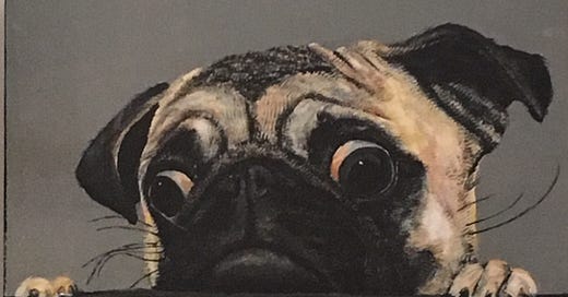
SPEAKING OF EYEBALLS
Questions? Thoughts? Drop me a line to learn more about our work at Muzzi Consulting or to share interesting copy. Writing questions also welcome.
And if you’d like to purchase this delightfully expressive painting, let me know, and I will track down its exact location for you. It’s somewhere in Brooklyn.

This boy deserves an almond and a good home.
From Muzzi Consulting, I wish you the same.


